What's happening in
This section may not cover every possible misuse of the logo, but it will give you a clear sense of what to avoid.
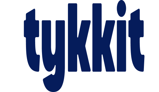
Don't stretch, squash, or distort the logo. Always keep its original proportions.
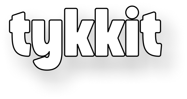
Don't add gradients, shadows, outlines, or textures to the logo.
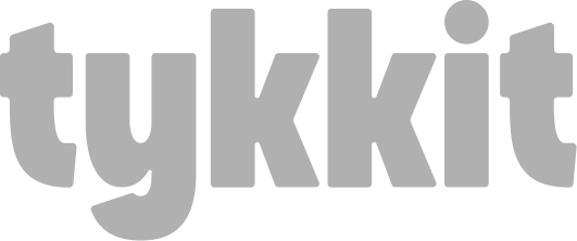
Don't use the logo in colors other than the official brand shades.
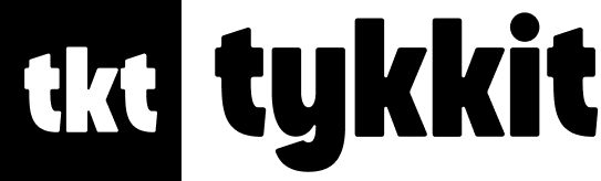
Don't change the logo style or add any icon before it.
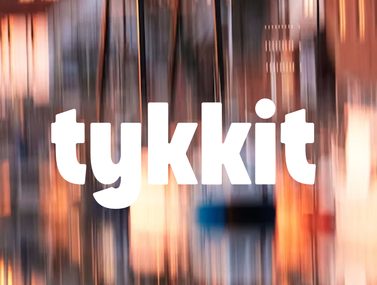
Don't place the logo on patterned or busy backgrounds. Use solid backgrounds only.

Don't change the app icon's style or color.

Do use the original logo in its correct proportions.

Do use the primary mobile app icon.
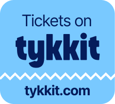
Do use the official badge exactly as provided.
Bricolage Grotesque is a modern variable sans-serif that blends clean structure with a playful character. It balances professionalism and creativity, offering excellent readability and a fresh, contemporary feel across digital experiences.
Get FontABCDEFGHIJKLMNOPQRSTUVWXYZabcdefghijklmnopqrstuvwxyz1234567890
Inter is a versatile sans-serif typeface crafted for digital interfaces. Its clean letterforms and balanced proportions ensure excellent readability at every size. Its neutral, professional look pairs well with diverse visual styles while maintaining a clear typographic hierarchy.
Get FontABCDEFGHIJKLMNOPQRSTUVWXYZabcdefghijklmnopqrstuvwxyz1234567890
Our brand color palette is a defined visual system that reflects Tykkit's identity and values. Each color is chosen to create a distinctive presence and keep our visual language consistent and professional across every touchpoint.
Download All Assets